

Sneak Peek: New Books, New Covers
Here’s last week’s post on Common Misconceptions about Publishing, no longer paywalled. (Want to read posts the day I publish them? Become an annual subscriber for $30/year).
Grab one of the last spots in my almost full book proposal course, starting July 7.
Belt’s winter/early spring catalog is set, with covers to match. We haven’t announced these titles formally yet, as we are working on finalizing the details needed to populate databases (aka “you won’t find these on Amazon yet”), but I thought it’d sneak in the announcements and discuss the process of coming up with their David Wilson-designed fits.
Our first title for 2026 is Elizabeth Zaleski’s funny and poignant essay collection, The Trouble With Loving Poets and Other Essays on Failure. We asked Elizabeth, as we do all our authors, if she had any ideas for the cover. She had a few, and I sent them over to David, along with Phoebe (the book’s editor) ideas, as well as the manuscript.
A week or so later, I went to a fabulous show at the Carnegie Museum of Art here in Pittsburgh of the works of Gertrude Abercrombie, an artist I had never heard of and was over the moon to discover. I went home and dug more into Abercrombie, reading up on her. As I did so I found myself thinking about Elizabeth’s voice, and her humor, and thought—wait—maybe a cover idea? Imagine my excitement when I realized some of Abercrombie’s works are in the public domain.
I sent this info to David, and he did a mock cover based on Abercrombie, as well as one based on the author’s concepts. I was thrilled when the author agreed that the Abercrombie cover was the best. And thus, drumroll….

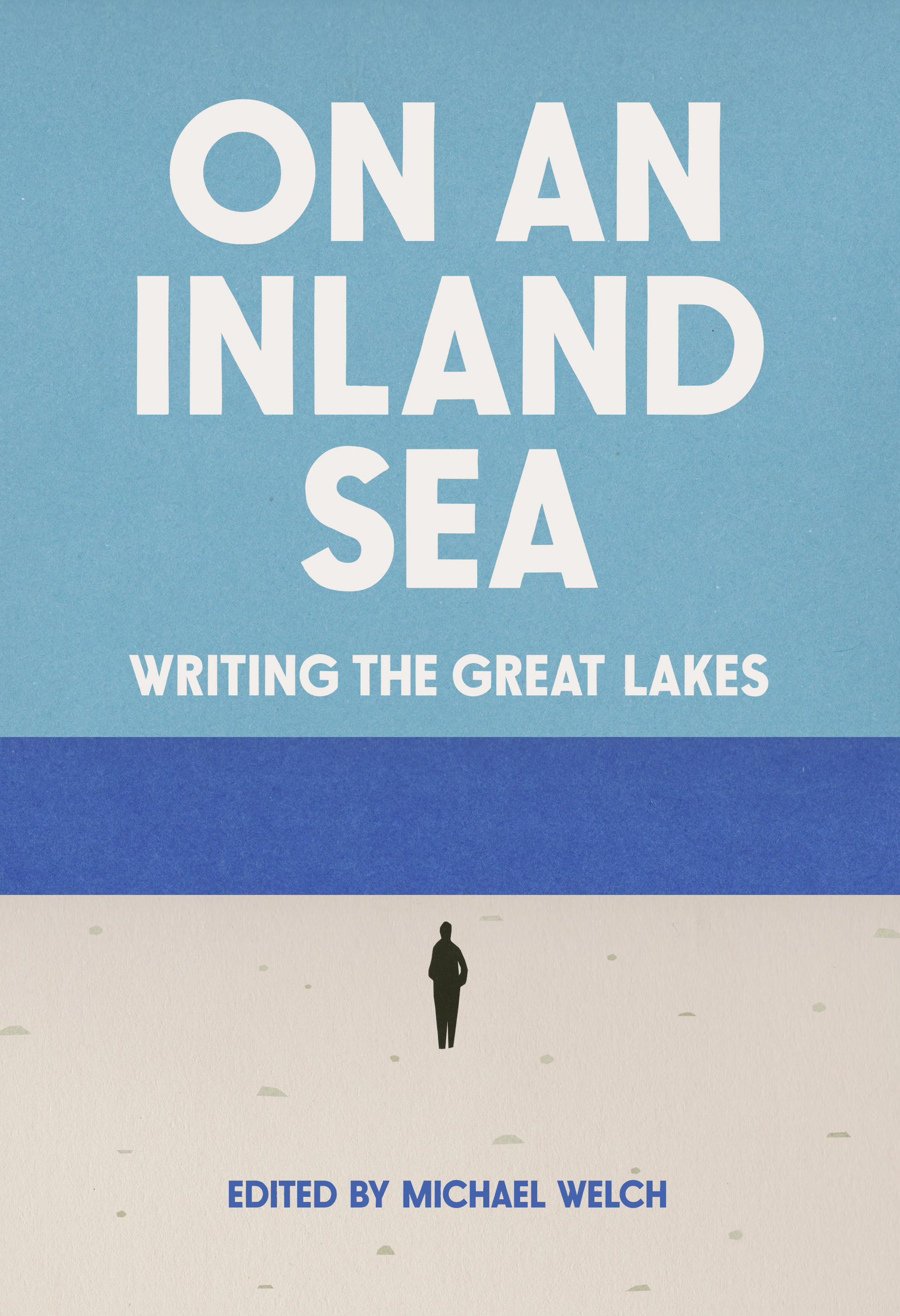
Come March we are bringing to you a literary collections of essays on Great Lakes, edited by Michael Welch. I did some looking about other book covers for books on this theme, and found a clear consensus: “water.” Michael was amenable to any direction we might take. So my notes to David were “water. Maybe with pine trees on the shore to distinguish it from other water?” This was not a particularly exciting start to this cover conversation. I also sent him the stunning introduction to the book.
I was resigned to a rather unimaginative cover for this one, but David found the spark. As he wrote:
I REALLY liked the introduction to the anthology and this idea of being small in the presence of the lake. I had this idea of simplifying the landscape down to create a sense of scale and getting abstract with it. I cut up some paper and made a collage... it's super simple but I think being on the great lakes or looking at the great lakes the sense of enormity of it all, to me, is these giant shapes (the beach, the rectangle of water that sits against a sky, etc.) Everyone knows the feeling of walking up to that water line and looking out to the horizon.
We all loved it, immediately. And voila:
In April, we will be publishing a new Revival, our series of public domain reissues. David and I had a blast figuring out the concept for this series when it began back in 2018—and he won an AIGA “50 Books 50 Covers” award for it. For this one, there was no clear object that I could pull out of the (extraordinary!) novel by Susan Glaspell, Fidelity, that we have chosen. Also, this is the most modernist of the novels we’ve chosen, and I wanted to indicate that somehow. I spent some time looking at this Penguin series and suggested David might go more in the direction of a pattern or repeated images instead of one as we usually do. He had fun and we again instantly adored the first concept he sent me. Here it is:

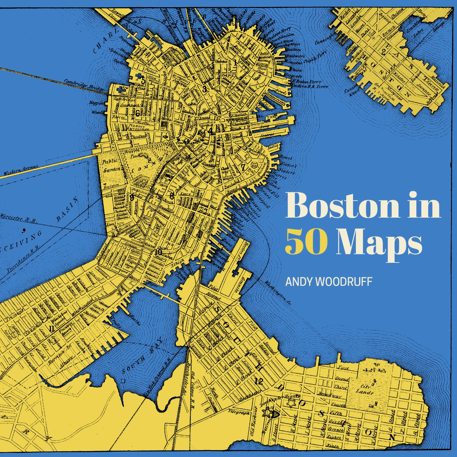
By May we will be adding a new title to our rapidly growing 50 Maps series (our newest one, Great Lakes in 50 Maps, has been selling so quickly stores can’t keep it in stock, but don’t worry—more copies are in trucks and everyone will be restocked momentarily). (Oh and yes we are venturing further afield with this series!) Our cover process for these is to ask the editor or cartographer for some historic maps to use as inspiration. Andy Woodruff sent us a bunch of cool ones, and David whipped up this beauty (I wondered about the cover scheme at first, but instead of sounding dumb and asking David, I googled and realized why he chose it) 2
David and I have been designing covers together for almost a decade now. It’s a relationship that has the depth and comfort of anything that has been simmering for a long time. It’s such an immensely gratifying, fun, and successful partnership. I can’t wait until we get to dress up more spring and summer 26 titles together.
Want to make sure you get all the info on this and other forthcoming titles? Belt has two newsletters—one targeted to those in the industry (reviewers, buyers, librarians), and one for the general public.
We have more titles to announce, but they are as yet naked.
That cover for essays on the Great Lakes is perfection. Love it.
Those are some of the best covers I've seen in forever. I was just in my local bookstore the other day and flattened by the flat affect and cookie-cutter style I was seeing on the new issues. Bravo to you and your team and thank you.