

Book Cover Aesthetics
Over on Instagram, David Wilson shows his process of designing a cover for a forthcoming Belt title, Be Not Afraid of My Body, by Darius Stewart.

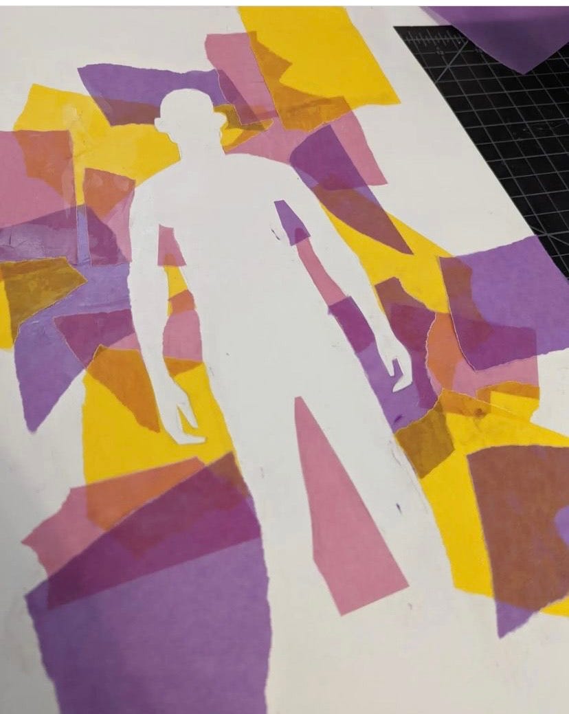

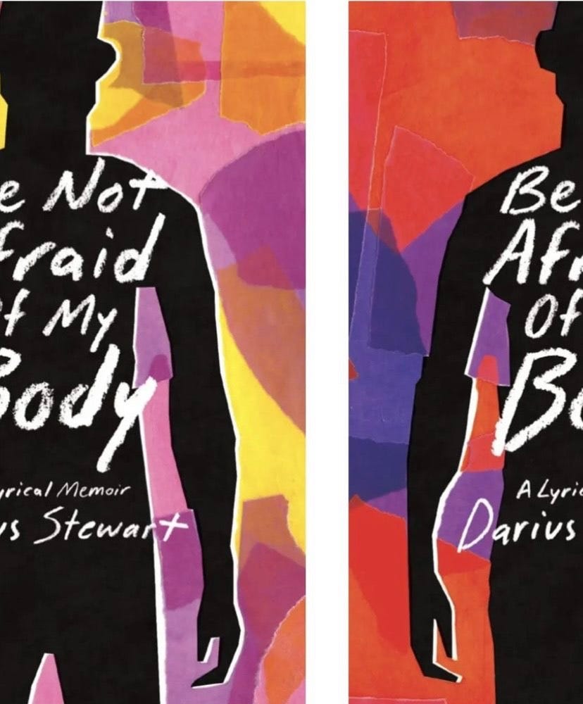
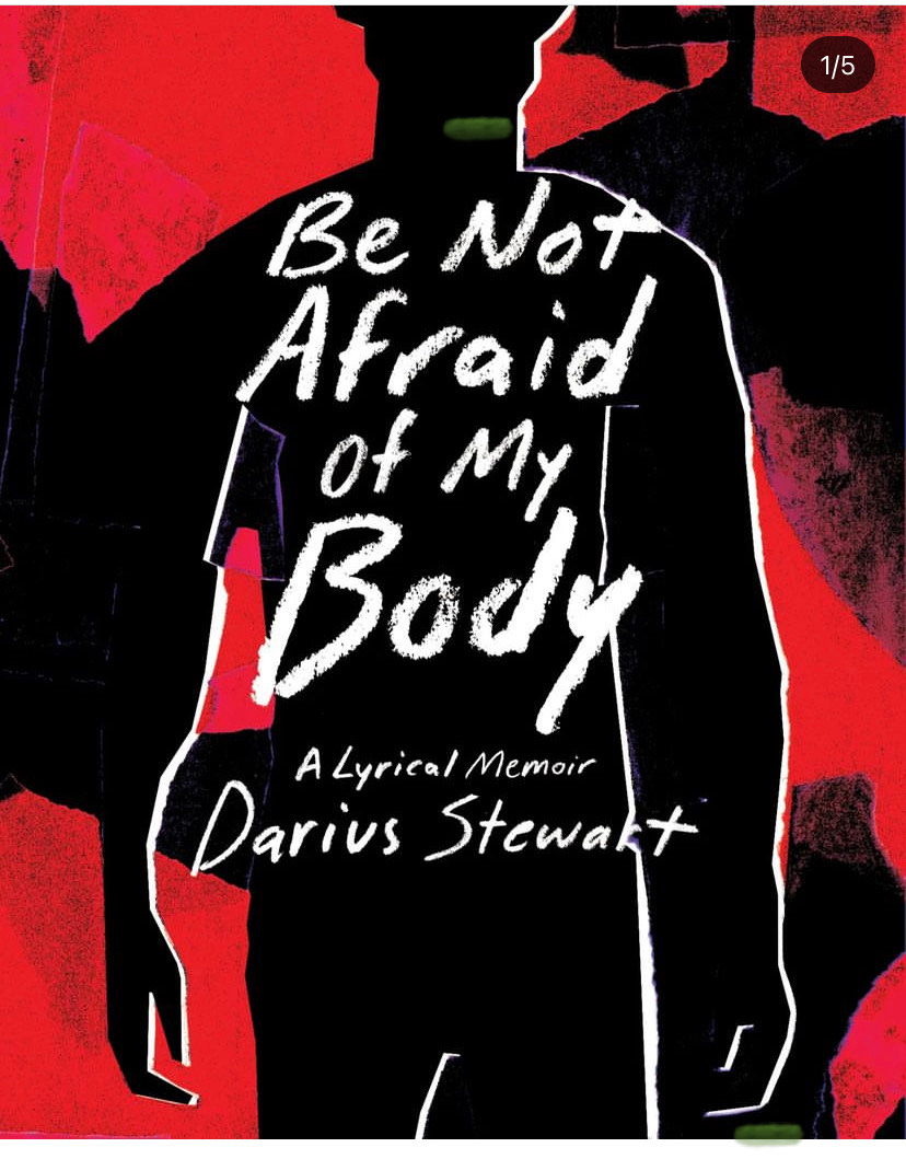
Beautiful, isn’t it? The process and the final product.
David also illustrated the cover for our forthcoming Love and Industry: A Midwestern Workbook by Sonya Huber. (David designs almost all our covers, but not are all illustrated), another gorgeous work for which the labor involved is too easy to underestimate.

Working with David on covers may my favorite part of my job. We’ve been collaborating for eight years now, and it only gets more fun (though clearly it’s easier for me to give notes than it is for David to actually create these works of art).
Meanwhile, out in Hudson News and bookseller front window-land, the blob cover continues its reign. It started a few years ago…

…and it continues unabated. Behold, the covers of the five bestselling books at an indie bookstore in April 2023:

Why this relative lack of creativity in covers—present company excluded, of course? It could have to do with corporate publishing wanting to simply replicate previous successes, taking few risks. It could have to do with our pandemic moment, and a desire for comfort through familiarity—a version of the Ted Lasso appeal. It might reveal a similar uniformity and predictability in the writing these covers envelope (though I must mention the exception of the absolutely fantastic Tomorrow and Tomorrow… since it’s in the screenshot above, of course).
How might we analyze it from the perspective of the digital age, and the ease of reading ebooks? Print books have a surprising hold on American readers: ebooks are, from my perspective, strangely unappealing to many. One might have predicted that, the longer print books continue to represent an increasingly rare analog cultural entertainment, the more various would be their covers. After all, it is the cover that most distinguishes the sad sameness of ebooks from print books. Instead, at least in the past few years, we’ve seen a narrowing of the aesthetic.
“It’s about the thumbnail,” people will say of this design. These covers are meant to pop on the book’s Amazon page, with the bold title type and wallpaper-y backgrounds, as well as in buzz book listicles in web publications. But that rationale has never really convinced me. Is there any data showing this type of cover leads to more “Add to Cart”s? The current number one bestselling book on Amazon does not even have a cover!

I will be arrogant enough to admit that I wanted Belt books to have a distinct aesthetic, and that David and I have worked to develop one over together. For me, the appeal lay in nodding to previous presses, imprints, and series that maintained a singular style: New Directions, Penguin Paperbacks, Vintage Contemporaries, Semiotext(e). We don’t have one template for all covers in a series, except for our Revivals, but several other small presses doing interesting things with design have gone this route, including Fitzcarraldo, Archipelago, and Europa Editions.
How else might we think about the work of the book cover in the age of ebooks? Can we go beyond “it’s good in a thumbnail” to analyze the hold blob covers continue to have? Who are the Alvin Lustigs (and David Wilsons) doing great covers these days? How do the economics of book design (aka what designers are paid, if they are gig workers or on staff ) figure in? And how does it change our understanding of book design to see David’s process for doing one cover, as in the above—in which he physically cut and pasted (no skeumorphing!).
My book proposal course starts June 5. There are spots left, and when those are taken, the link will list the course as sold out. So as long as the site allows you to, you can sign up! (I get many emails asking if it’s sold out yet).
Succession recap: I feel smug about last week! (“I predict ATN is going to rig the election, and Tom and Roman will be to blame.”) I have no predictions for next week, apart from wondering that if the writers leave with anything is not cynical or insanely depressing at the end, it will be that the women—Shiv, Gerri, Marcia, Abba— come out okay, maybe even with more of the spoils—as the writers turn up the volume on the misogyny of all the men.
My favorite of your covers was Erin Keane’s Runaway.
I can’t read Tomorrow and Tomorrow...to my eyes it is illegible.
And can we talk about Chemistry Lessons? I had refused to read it because the cover told me it was a “certain genre” that I don’t read. Then,l my book group went crazy for it and we added it to our fall lineup. I think the British cover is SO much better! SO MUCH BETTER!
Speaking as a Belt author with an absolutely beautiful cover designed by David, I love seeing his process like this! And also, YOU WERE RIGHT ABOUT ROMAN AND TOM. Now let's see how they all step in it one after another, now that Shiv has made her own fatal blunder (threatening Greg instead of bribing him onto her side).